Wednesday, December 31, 2008

THE DOG DAYS OF JANUARY?

Not likely! I believe those days are in midsummer.


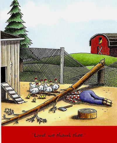
(With credits to Barron's magazine and Frank Cotham)

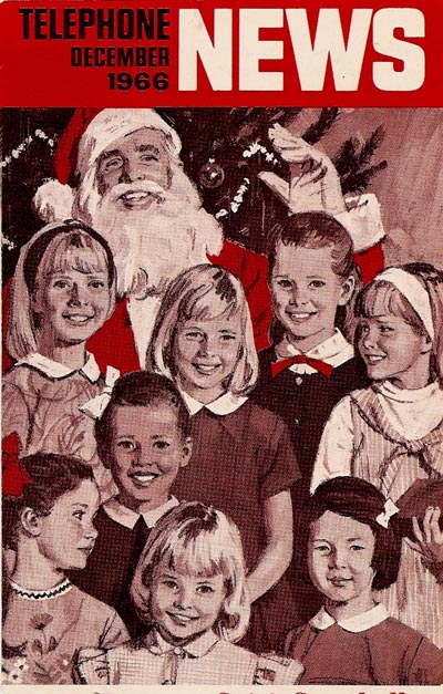
But with this year's frigid winter, the cartoon just might warm a few hearts. The CAWS will head back to the early 50's, and the B&W PG&E consumer ads of that time. Most include dogs. They were an important family symbol.


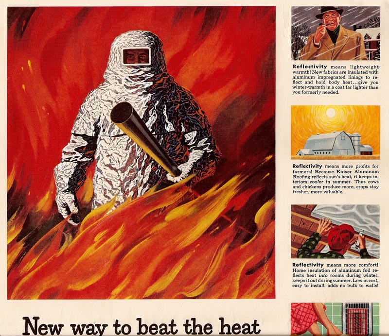
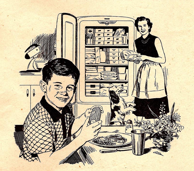
These ads were about young families, and about selling new appliances....no one worried about using too much energy back then. This group should pretty much finish the scans of that PG&E series, with the exception of three or four 'location' ads showing low energy rates in California.


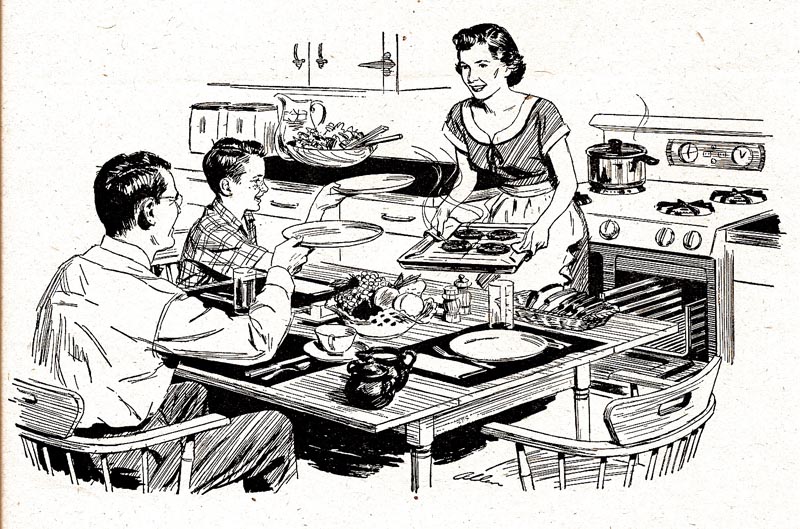
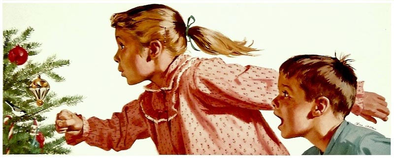
All of these are self explanatory....really, not much to say about them. Pen, brush and ink on Whatman Illustration board. As I remember, time was usually short. The AD at BBD&O would send over an ad layout....the illustration space left blank. We'd talk over instructions on the subject and appliances...a comp not needed. We were fond of dachshunds then, and we ended up owning one for about seven years. Definitely a character, and a great rat-catcher, he appeared in several ads.


Bruce Bomberger and Stan Galli used to favor dalmatians, the 'fire house dog', in their illustrations. For some reason, and for drawing purposes, I preferred spaniels and terriers.


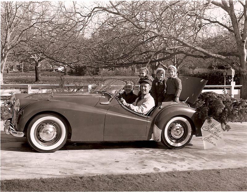
My wife and oldest daughter posed for the 'bank book' ad.


Our two youngest were the little ones in front of the red leather chair with the relaxed dad. Won't identify him...


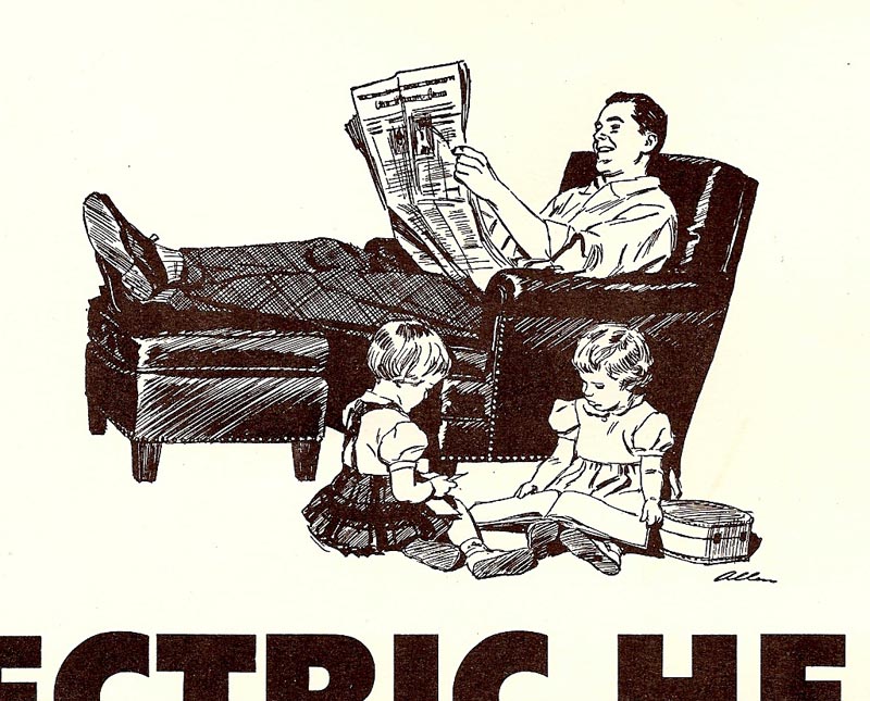
...except to say, I always improved the model!

Happy New Year!

Charlie Allen's Flickr set

Monday, December 22, 2008

'THE CHILDREN WERE NESTLED...

ALL SNUG IN THEIR BEDS....
WHILE VISIONS OF SUGAR PLUMS
DANCED IN THEIR HEADS!'

I know....a very retro Christmas CAWS this week. However....it was ready to go and couldn't wait for next year.

It should be pretty obvious to any interested viewers that the CAWS is a 'limited edition' publication. The venerable large clip and proof drawer has definite limits. Hopefully, for what it's worth, we have several months of mid-century illustrative 'odds and ends' before a merciful fini is announced.

Leading off, a Bank of America billboard and bank poster, my oldest daughter and a neighbor youngster the models, about 1956. Not sure why the caption is missing. A challenging illustration for me at the time....trying for an early morning lighting effect, and that 'bicycle Christmas' expression with the kids!


Next, an early 50's PG&E pen and ink, one of the newspaper consumer ads in the B&W series we've seen before. This one timed for Christmas, the across the street roof lighted display a bit of a workout! There are a few more in that group still to be 'CAWSd' in weeks to come.


An E&J Gallo Brandy point of sale poster follows....the scan a bit weak, from a smaller reproduction that I had. Gouache again, largely done in watercolor-like washes. One of the advantages of gouache is the versatility....and it's faster and easier to use than acrylics.


Then another Gallo, this time Ernest and Julio's 'personal' Christmas card (I did several of those). It really went to hundreds, or maybe thousands, of Gallo clients and dealers.


Finally, two more B&W US Steel illustrations....featuring....and back by popular demand....our high heeled 'lady of steel hostess' with an all steel Christmas! No doubt a few more in that series will be seen down the line.


O.K....time to say 'Cheers and Happy 2009!' to viewers of TI and the CAWS.

* Charlie Allen's Flickr set

Tuesday, December 16, 2008

'TWAS THE WEEK BEFORE CHRISTMAS

ON A CLEAR STARRY NIGHT....
THE CITY'S LIGHTS SPARKLED


WHAT A WONDEROUS SIGHT!

....To paraphrase the old poem by Clement Clarke Moore. And yes, illustrators tend to build on reference! This 'impressionist' version of San Francisco, back in 1974, was the only record album assignment I received over the many years. As said before, S.F. was not really a publisher of records and entertainment. This came from the Embarcadero Center, a big S.F. developer and promotional group. Instructions.....elevate and feature the Coit Tower on Telegraph Hill....and make it festive and bright! I recall taking some late afternoon shots from Treasure Island, mid bay, and then improvising on the city's skyline. For what it's worth, the method here was much like the 'old school house' for US Steel, seen earlier. Heavy brushed gesso on illustration board, thin to thick gouache brushed and palette knifed on. My 'palette knives' were several small pieces of illustration board, cut in strips, 1/2 to 1 inch wide, the edge dragged in paint, then applied or scraped on. It works! I liked the rough texture of the illustration contrasted and made more stable by the beautifully designed title in script form.

We'll have a Christmas ad theme this week, and hopefully the next. Just in case, however, the CAWS would like to wish a hearty 'Merry Christmas!' to any and all viewers of TI and this blog over the past several months. It has been an interesting and rewarding experience....and Leif has been valiant in his support.

The next three scans are the now familiar 'Telephone News' mailers. Christmas subjects....usually received in a very non-Christmas time of year....sometimes mid-summer! But, that's life for many businesses. Spring and summer merchandise is often shown and advertised in the winter months.


I'll include two Gallo comps in pencil....for a POS Christmas poster in the 70's.


Last, a blast from the past! When our family was young, and even through our daughter's teen years....with my trusty Speed Graphic camera set on timer....I would take, develop, and print a B&W family photo each year for a Christmas Card. This one, in 1957, with my lovely wife and our three prides and joy. The mechanical 'pride and joy' was a bright red '55 TR-3 Triumph sports car.


To be honest, it rode like a brick....fun, but not sprung for comfort! It, or I, lasted for about three years before a replacement was made.

Charlie Allen's Flickr set.

Tuesday, December 9, 2008

'IF YOU CAN'T STAND THE HEAT....

....stay out of the kitchen!' Pretty sure that admonition came from the feisty president, Harry Truman, way back in the 40's. Politicians, however, aren't the only ones having to withstand more than a little heat in their occupations. Many, if not most jobs, involve one form of 'heat' or another. That's why it's called a 'job'!

Certainly the advertising illustration business had it's share....from nearly endless tight deadlines, odd, impossible, or inappropriate ideas on illustration subjects, 'changes' that made little sense to the ad....whatever! Of course, the eternal wrestle with the technical was present....finding adequate reference or models, boards and paper, pens and inks, brushes and paints, odiferous markers, and 'Murphy' was never asleep! The usual problems of making it all work.

The CAWS will return to the Kaiser Aluminum ads of the 50's this week. First, the aluminum clad fire fighter, one more example of Kaiser's relaxed attitude on products.


They liked drama in these national magazine ads....and fire was an attention getter. The agency, Foote/Cone, or Kaiser, provided a photo of an asbestus type fire suit, a square windowed head hood, and a large CO2 nozzle....very much like the illustration depicted. When I inquired, 'where is the aluminum?'....the answer came back....'just make it look like heavy aluminum foil'! I believe this was my second Kaiser national ad....the first being the youngster holding aloft the aluminum stroller.

Next, the unlikely aluminum skillet held over a roaring open fire....but, what the heck....it's dramatic and gets attention. It's advertising!


The ad was a double page spread in SE Post and several other magazines. Regarding the right side, with some of the spots: note the mom is using the power mower! The one shown was our first Briggs and Stratton gasoline powered mower.


And finally, a couple of Kaiser ads featuring just the spot illustrations....again, back in the 50's.


Next week, a bit of Christmas cheer....from the ad world!

* Charlie Allen's Flickr set.

Tuesday, December 2, 2008

THE BIG APPLE....

No, not THAT 'big apple'....NYC. And not the dance fad called the 'big apple' way back when I was in high school. A group of couples forming a circle, a few brave ones stepping out in the center doing a solo dance called 'truckin'. Not for this cat!


In this case, the 'big apple' was the Washington State Apple Commission, which promoted and sponsored the large variety of apples and pears grown in the Pacific Northwest....advertised, distributed, and sold around the country.


The ad agency, I can't recall now.....BBD&O, Foote, Cone & Belding, McCann Erickson? Not sure, but certainly loyal clients for Patterson & Hall, and for me. The assignments were mainly 'point of sale' posters, banners (they were hung on wires), and displays. They were widely used in supermarkets in those days.


'Point of sale' displays and ads have largely disappeared from food and produce sections in modern times....giving way to the esthetic, environmental, less commercial, and I should add, more expensive produce sections installed in supermarkets these days.


This week's CAWS will show a few banner examples, plus a few close up sections (out takes?) from a large, and now timely, Christmas poster.


These were straight arrow, literal but bright, renderings of the product.


All were done in gouache, before acrylics. The full poster, too large to photo and scan in my usual method, was not that great. But I liked the color and loose technique in general.


Last, still on food, 'one more time!', a rescan of the familiar Lucky Lager Thanksgiving poster....showing it did have both color and value.


* Charlie Allen's Flickr set.

Tuesday, November 25, 2008

THANKS FOR THE MEMORIES.....

This week, on Thursday, 27th November, the USA celebrates it's traditional Thanksgiving. We'll open the CAWS with a classic Gary Larson cartoon....and offer many thanks to Mr. Larson for a million laughs over the years....way out there on the 'far side'!


Today....in spite of the current global and domestic financial meltdown....and not to mention the normal pitfalls of our human existence on this somewhat weary planet....most of us have much to be thankful about. Not least, as I write, I'm grateful for 'Today's Inspiration', and for Leif's untiring efforts to inform and entertain with historic artists and illustration. This week he informed me of the Google Analytics chart showing the number of visitors to TI and the CAWS from around the world. To this old timer, just mind boggling....and I'm thankful for the chance to share some of my efforts and interests, over a lot of years, with generations from the digital age'.


A 'Lucky Lager' billboard (above) to start, from a poster, again photographed propped up on a patio chair. Not the greatest fidelity. The turkey, still in plastic wrap, and the laden 'Lucky' shopper, are the only Thanksgiving illustration I recall doing. I illustrated many Christmas themes...and have done a bunch of 'turkeys'....but those are of a different definition!

We'll return this week to many of the rest of the 'Telephone News' mailers from the 60's. I enjoyed the variety of subjects.


Most of the technical reference was provided by BBD&O, and the rest, including most figures, by the illustrator.


All were done in a gouache technique....using Windsor Newton Designers Gouache, Perma Greys Gouache, often with Liquitex acrylic matte medium mixed in.


* Charlie Allen's Flickr set

* Gary Larson cartoon © 1992 FarWorks Inc. All Rights Reserved.

Tuesday, November 18, 2008

¿Habla usted español?

A few phrases are remembered from high school Spanish... and I'll assume this one is correct. Scrolling forward to the 70's, Here are some brochure illustrations for a language TV program for Spanish speaking youngsters... no doubt through PBS stations in the S.F. Bay area and So. California.


That time frame may sound odd now... 'forward to the 70's'... but it was my third decade of illustration in San Francisco. As previously mentioned, work had changed drastically over those years. I was kept busy... more brochures, trade ads, 'point of sale' assignments, new and different agencies and accounts. Billboards - with the exception of the occasional highway painted bulletin and big magazine ads - had disappeared... and most of the 'big budgets' to boot! TV had become the '600 lb. gorilla' in the ad world. But other things... and a lot of variety... filled in.


More one and two color ads were the norm. The Spanish language brochure was essentially black on toned paper stock....and I used my weapon of choice in those days, a General charcoal pencil on cold pressed illustration board.


I'd like to add (and I haven't mentioned this) I worked with some great and talented guys and girls at P&H... and at the advertising agencies. There were creative ad designers and lettering designers, well before the age of instant computer generated fonts and designs... cartoonists, production experts, et al. We worked as a team... and I credit much of my stuff to those talented people. It was a pleasure working with professionals of that caliber!


Following the brochure, a couple of illustrations using the same method. Although legitimate jobs, I can't recall where the 'historical' montage was used...


...and I'm drawing a blank on the 'pencil on rough board' portrait. I think a local S.F. journalist...


...but just too many years!

Will try one more... ¿Habla usted inglés?

Charlie Allen's Flickr set.