PERFORMANCE IS SWEETER, NOTHING CAN BEAT 'HER
LIFE IS COMPLETER IN A CHEVY....
SO MAKE A DATE TODAY TO SEE THE U.S.A.
AND SEE IT IN YOUR CHEVROLET!'
OK, OK.....that should do it for the Chevy ad jingle....as well as for most of the Chevy ads I illustrated. We'll begin with the now familiar yellow Corvair ad done sometime in the 60's. As with many jobs, a story goes with it....hopefully not too boring.
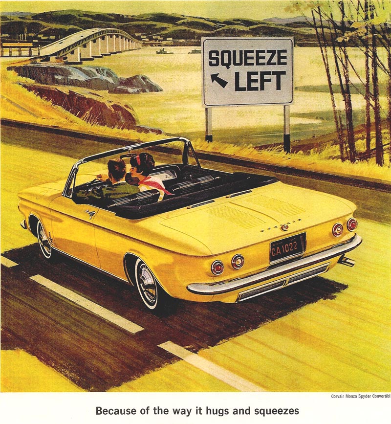
Chet Patterson and Jim Hastings, sometime in the 60's, had a falling out. I never knew why....and this ad came through Butte, Herrero, and Hyde, a well known creative-design team in S.F. Several illustrators were invited to submit color comps for two magazine ads. Mine and Gordon Brusstar's were selected by Hastings. My comp had the same bridge and bay scene, 'color coordinated' around a light blue Chevy Corvair. The Chevrolet people liked it, but ordered a yellow Corvair to replace the blue. That, I reasoned, encroached into my ' artistic domain'. No way could I illustrate a bay scene coordinated in yellow tones! On the finished art, I changed the background to a rural New England scene....a small maple sugar outfit, trees, barns, a few patches of late snow, etc. Jim Hastings liked it, but it was turned down flat by Chevy. The illustration was sent back....it had to be the bay scene....or else! To save all the hard labor on the Corvair, I covered and masked it....sponged off the maple sugar location, gessoed the background, and re painted the bridge and bay. Yep....in color coordinated yellows, greens, etc. So much for artistic liberty!
The next scan, a double page ad in the S.E. Post, a profile view of a 1955 pink and black Chevy.
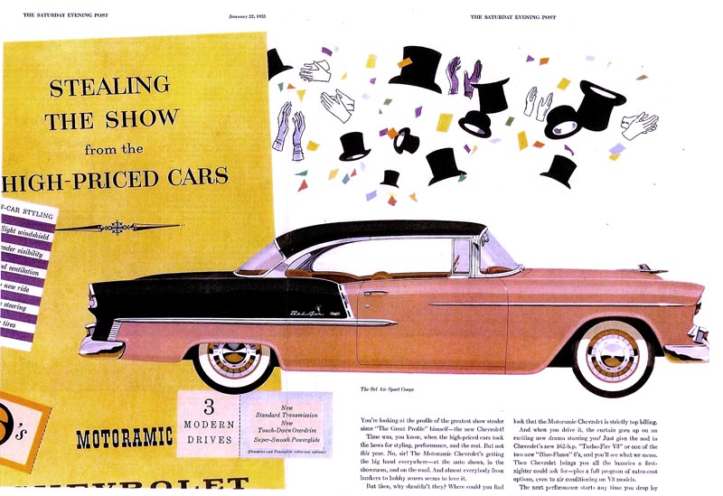
General Motors was very proud of this car....the first 'wrap around' windshield in the business, a great new V-8 engine, a new look.....and of course, a big seller. This ad was the first color assignment I had received from Campbell Ewald....and a Jim Hastings layout. In the mid 50's two color autos were the new 'in thing'. We owned a '56 Chevy station wagon in grey and white.
Following....three color illustrations scanned from 8x10" B&W photos taken at P&H before the jobs were shipped. Actually better fidelity than something in color. First, another hill scene for magazines, previously seen here on TI in color. I liked the background vignette of the boiling over hot rod, young owner, and disgusted date.

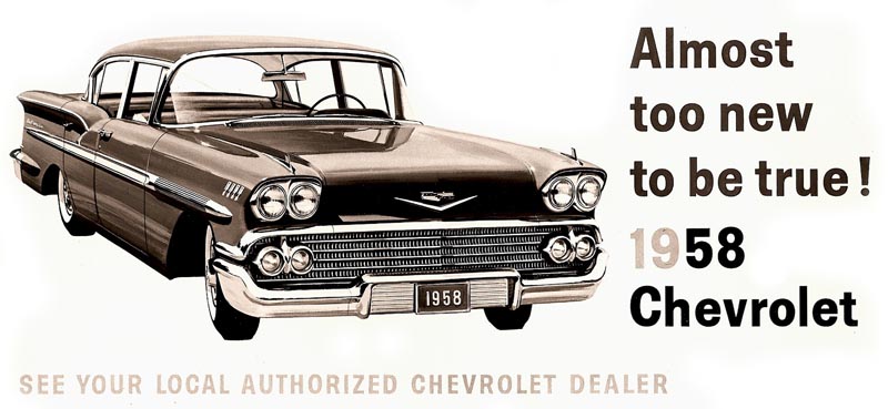
The next two were Chevrolet national billboards....a 1958 Chevy...
...and a 1957 Chevy convertible showing the couple with the door opened. An unusual concept for Chevy, but considered successful. A bright, colorful ad with a teal blue car and a yellow dress on the young lady.

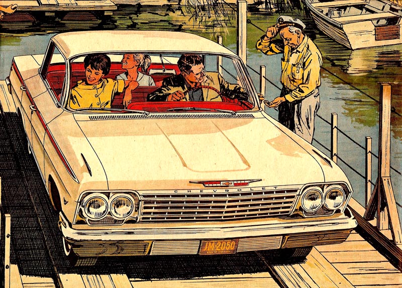
Next, a '62 Chevy full page newspaper B&W line, plus color, ad. A rural 'lazy river' car ferry scene....no doubt somewhere in the south. I had to pretty much 'design' the ferry...and it was probably not all that feasible for a real life operation. Once again....advertising! Done in the usual method....a B&W line film pos over a color rendering.
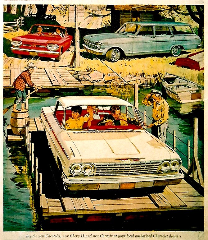
The close up of the Chevy is a better example of the way it looked.
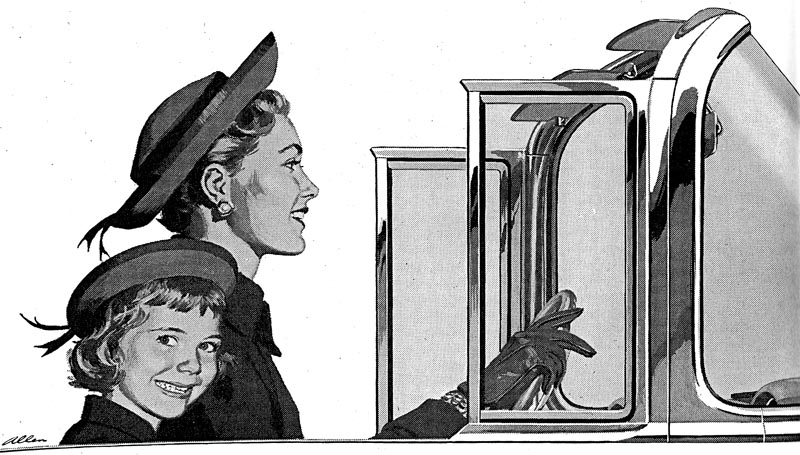
A different kind of ad follows for 'Body by Fisher', a separate division of GM, as I recall. 1955 saw the first 'wrap around windshield' in the auto industry, and Chevrolet was very proud of it. This, a B&W halftone, just the windshield, the roll out 'wind wings', and chrome moulding ....my wife and daughter, the models. Not sure where the copy and headline were....probably under the art.
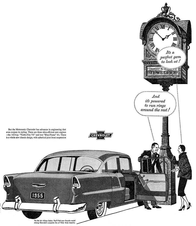
Last, my first or second Chevy B&W ad. A posh, morning coated, striped pants with spats, jeweler....helping an equally posh lady into her '55 Chevy. Must have been an expensive purchase! The tall street clock, a close copy of a well known clock on Market Street in San Francisco.
* Charlie Allen's Flickr set.

6 comments:
Hi Charlie, Great art as usual. Some of those ads look like they were pretty tough to do, especially under short deadlines. Top notch work ! I do remember seeing a couple of these when I worked at CECO.
Harry
HARRY....I'll comment on your blog on this blog! So interesting, our parallels on affiliation and times with CE and Chevy. Those ads were all a work out....each different on subject requirements, techniques, etc. Some were just too ambitious and large for line work....but I wasn't about to turn any down. Also, as you can see, I pretty much started from scratch and learned on the job. As you said, a lot of line work was done with small brushes....not pen and ink. Other than Jim Hastings, didn't know the art directors back there....but they were great to deal with. Later on Jim seemed very bitter, in my experience. Not with me, but in general...don't know why. Maybe you know more about that. Thanks again for your experiences and comments.
Charlie,
I was inspired as a kid by illustrations like yours in the magazines. Especially car art. ( They are just as inspiring today ). I am an illustrator today because of that. It's also incredible when you write about technique. Like masking off and sponging away a background on the Corvair ad. That was photoshop in the fifties. Amazing. My career bridges analog and digital and analog by far requires more skill, and I'm afraid will become a lost craft. Thanks for sharing your great work and words.
Steve Foster
Charlie, I like the yellow color scheme with the bay and bridge background. I know the frustration though, your brain is geared up for a blue car and related color related background... hard to switch gears, when satisfied with the first version. A lot of extra work, and especially self discipline, but you really pulled it off! That monochromatic look, as I remember, was quite popular back then, and for good reason. It visually has a color harmony and unity that quickly sets the mood. As Harry stated, top notch work!
Tom Watson
I can only second to that!
The golden yellow overall harmony...I would never have had the idea that this great ad would have been planed in another color tone, as the interesting story goes.
Guess you would have succeeded in any color, even if you had been reordered to do it in pink or in bleu fayence.
Yeah, the wrap-around windshields were a great design improvement. Those cars look gorgeous and gorgeously you embedded them in all those scenes and landscapes, Charlie. Hats off!
"As Basie said...'One More Time!"
...is that "Count" Basie?
Can I add my voice to the chorus of approval for the yellow colour scheme? Creates a great mood but needed a great artist to pull it off! Tip of the hat to you Charlie.Any possibility you could share some pointers on your gouache technique some time, I'd love to know how you guys blended flesh tones etc. Top blog, thanks!
Post a Comment