TO RENEW OLD MEMORIES!'
Ah, yes....two lines from 'Sentimental Journey', the famous big band hit by Les Brown, sung by Doris Day, on juke boxes everywhere in 1945....and played probably a dozen times each evening in our bar. Our bar??!! In the closing months of that year, we were in the 'Occupation', in Tokyo living 'in style' in a four story former Japanese Army and Navy officers building, across the moat that surrounded the Emperor's Palace. We had just moved up from dirt (or mud) floor tents on Okinawa....and now had bedrooms with real beds, furniture, a dining room with table cloths and kimono clad waitresses....and yes, a bar....warm Japanese beer the only beverage! Army food was still being served, almost all of it dehydrated or canned, but it tasted a lot better in those surroundings. I was with 5th Air Force headquarters, hence the royal treatment. That building, and a few larger buildings further around the palace, where Gen. MacArthur had his staff and headquarters, were spared the devastation that befell the rest of Tokyo by the close proximity to the Emperor's palace. That was technically 'off limits' during the large bombing attacks earlier that year.
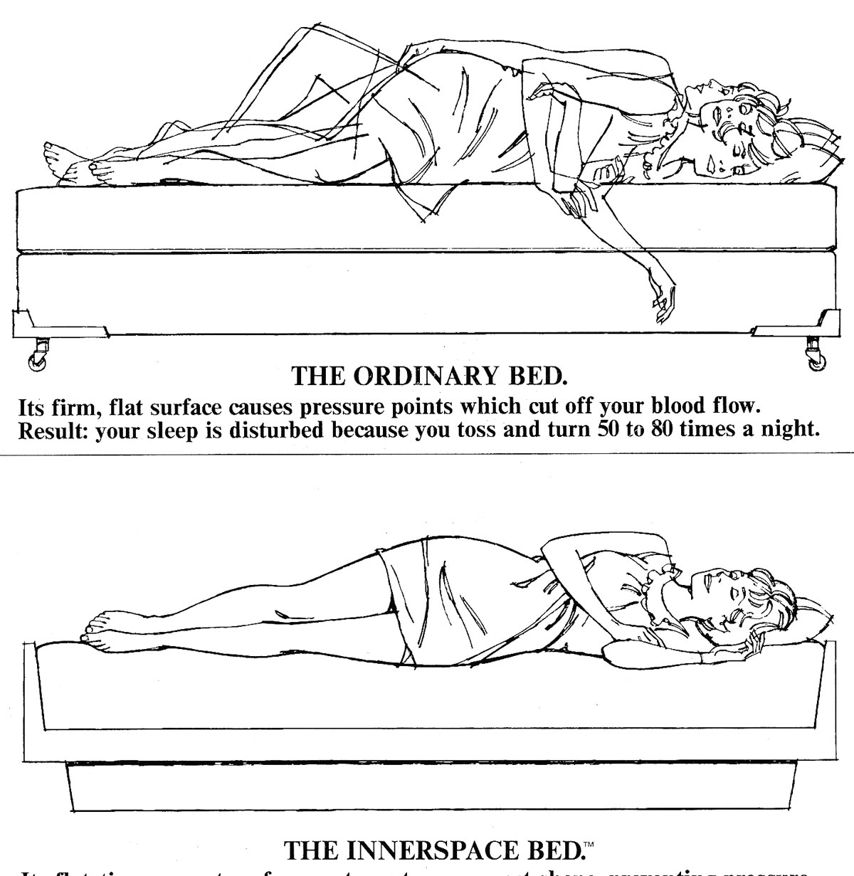
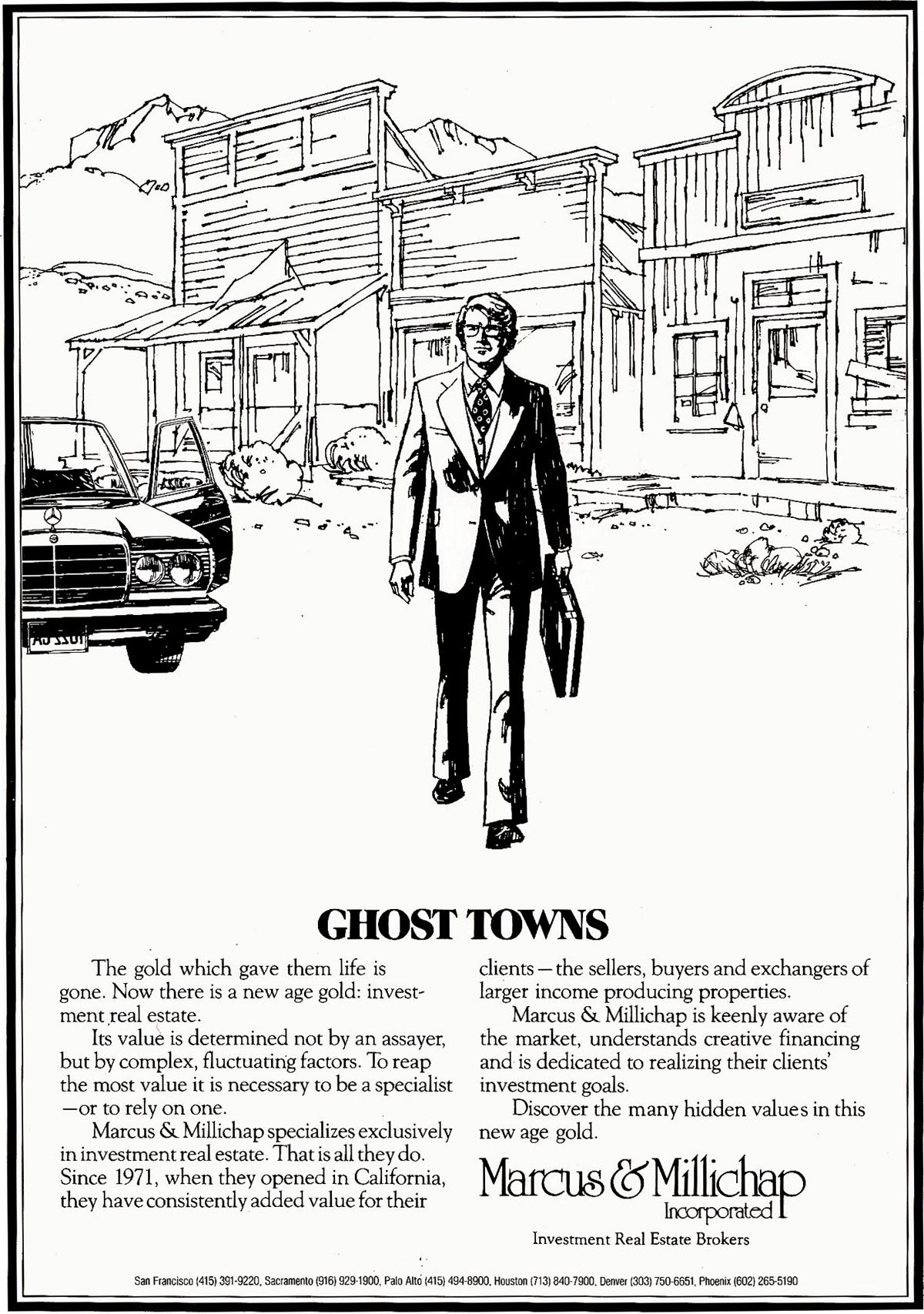
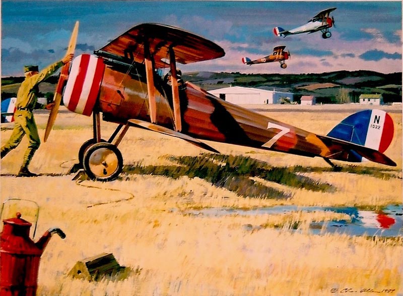
A CAWS challenge the past year has been to make the blog long enough to be of some interest....but short enough to not bore the socks off viewers. It may be a test this week with the nostalgia thing. First, some non-ad illustration....and then some photos. Somehow, in the busy 70's, I found time to explore a print biz.
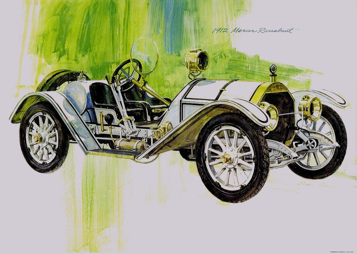
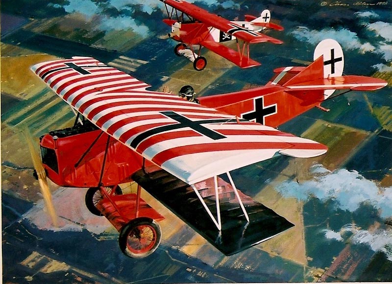
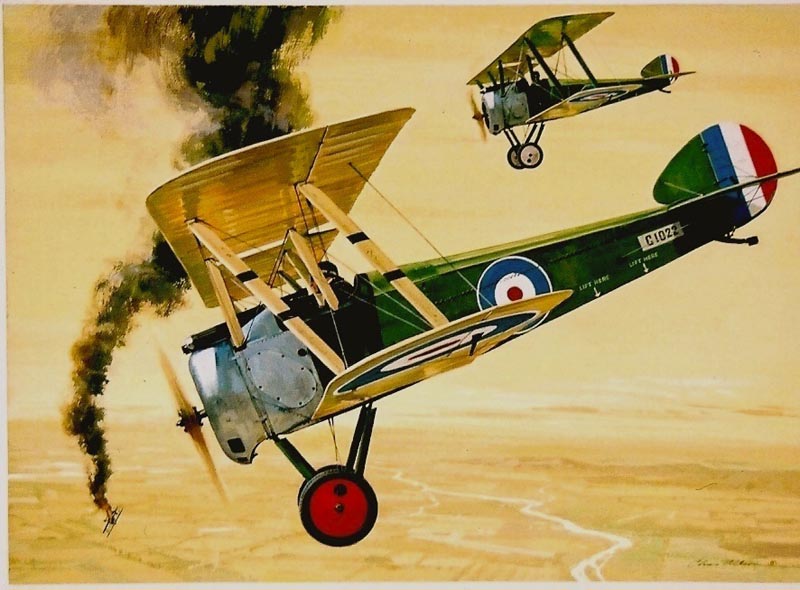
This was long before the 'limited edition print' fad arrived in the 80's.... another story for another day. My 'business model' (no one had heard the term....there were no MBA's in those days) was flawed, as are many amateur endeavors. Long on production, short on sales distribution. Intended for 'kids' and kid's rooms, dirt cheap compared to later on, a series of four illustrations of several subjects....antique sports autos...

... WW l airplanes, horses, African animals, for a start. All, of course, subjects that I or my daughters liked. In my 'spare' time finished a bunch of these, the old cars were reproduced. Those were a 'test market'....by the author, entrepreneur, and marketer....me. I found they sold rather easily to several bay area book stores....but it took a lot of time and effort to move a few dozen prints. The light finally dawned.
Needed was a real sales plan....without enough product to warrant one. I wisely gave it up.
Enough....I knew this blog would get long winded!
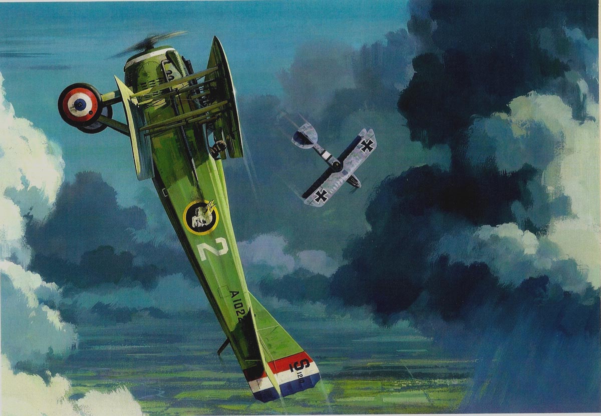
Unlike Harry Borgman's fine illustrations, and a host of other old airplane illustrators, these were intentionally more airplane portraits than combat scenes. I envisioned the 'buying moms' accepting the ideas!
Next, a few photos I had promised earlier. A first 'homebuilt' design by the now famous Burt Rutan (designer of the around the world non-stop 'Voyager', 'Space Ship One', etc,).
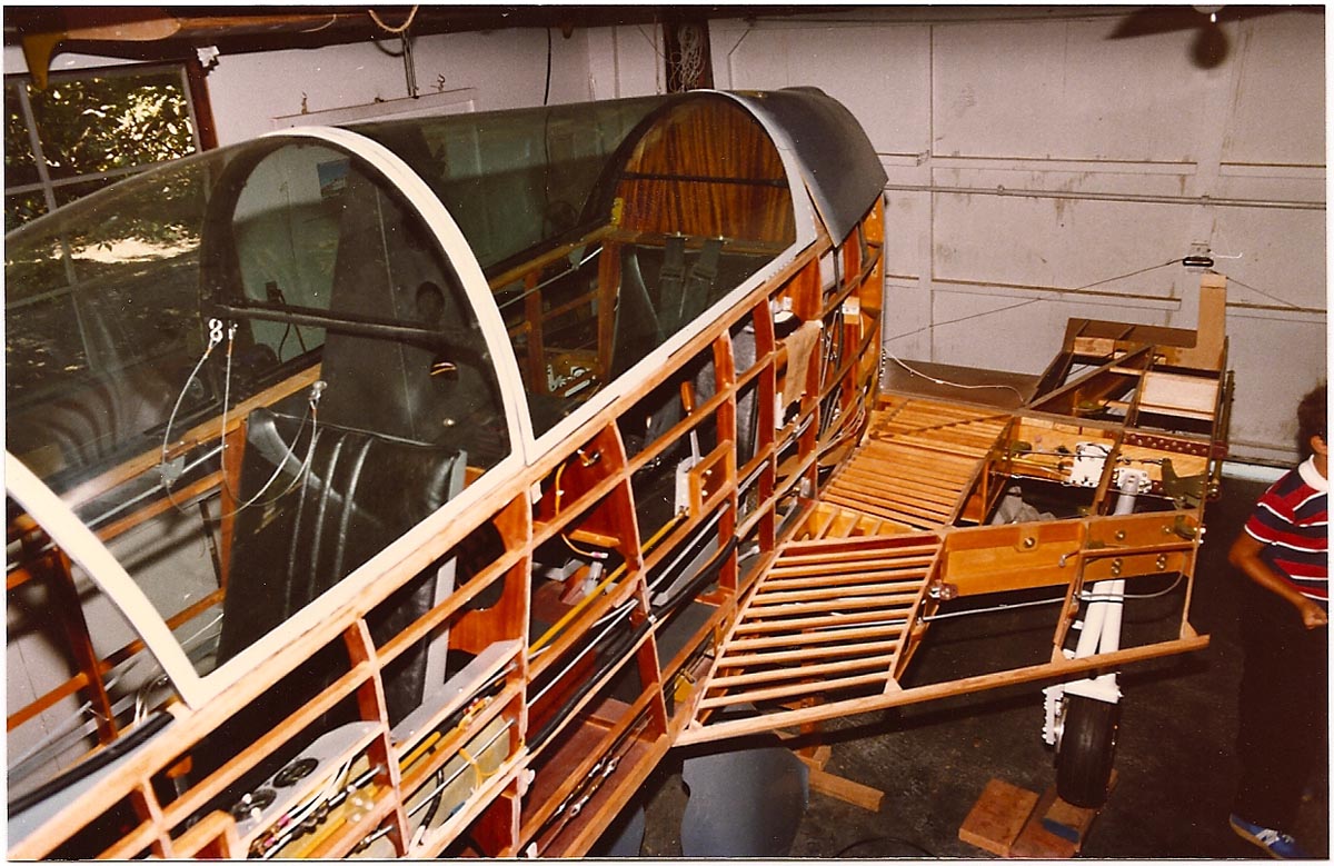
This one, the 'Variviggen', was made from plans and a few fiberglass parts....and before today's complete kits, pre-drilled,every rivet and nut included, etc. Mainly Sitka spruce, aircraft plywood, almost all parts and metal fittings made by yours truly, the builder.
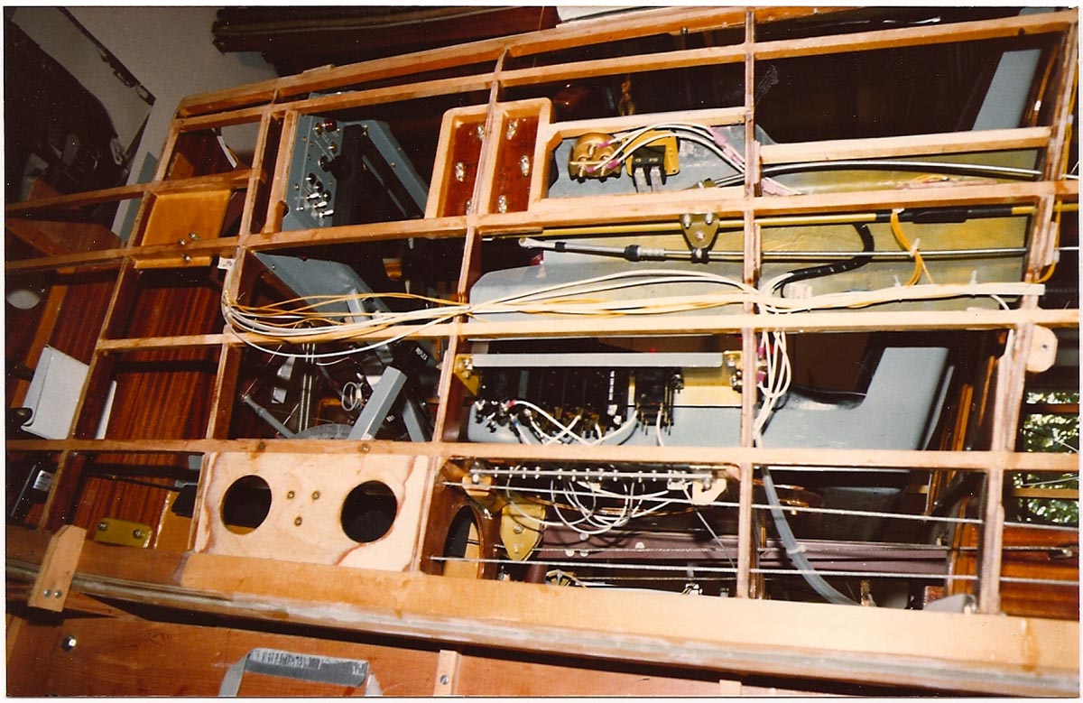
A retractable gear, delta winged, rear engine pusher....really too sophisticated for a homebuilt. For eight or ten years into the 80's, an evening hobby and a 'diversion' from regular work.

At least it was close by....across the walk to the garage. Never finished, I'm sure fortunately!

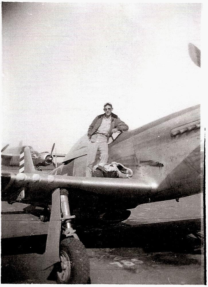
Finally, some fuzzy photos from a tiny 18mm Japanese camera....a blast from the past. Personal cameras were forbidden by the Army when we flew our PBY overseas....from Savannah, GA, ending a couple of weeks later on Luzon in the Philippines. That was early in 1945. The hot humid climate spoiled film fast, anyway....and any photos taken by military photographers had to go through stiff censorship if sent home. In mid summer I was transferred from a squadron to 5th Air Force headquarters at Clark Field. As 'rated' (flying) personnel, we had to log four hours flying a month to receive flight pay....a third of our income....which for a 1st Lieutenant was $240. Good pay in those days. The small 5th AF 'airforce' at our disposal included a B-25, a couple of C-47's (DC-3's), a retired 'razorback' P-47, and a half dozen P-51's. The bigger planes required a minimum crew of three....hard to arrange. At Clark Field I chose the P-47....a far cry from a PBY....and kind of like going from a truck into a NASCAR open wheel race car! In late fall in Japan, I checked out in the P-51. I managed to log about ten hours in each plane, without major damage to either plane or pilot, before being shipped home in January, 1946. The first photo shows some of our 'airforce'....wooden Japanese hangars on the left

The next two, a possessive, hand on prop pose. Attitude, 'well, I tamed this beast!'
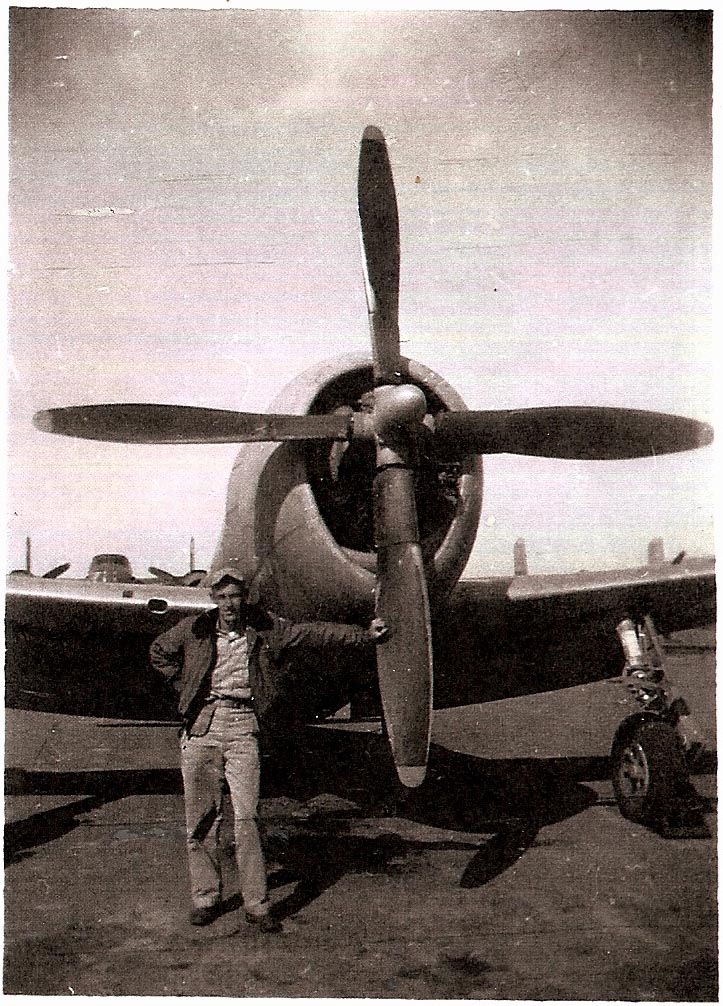
Attitude, 'well, I tamed this beast!'

Last airplane....and the only 'homebuilt' finished....was a 'Gee Bee' racer mailbox a few years back. The real one, a short little barrel of a plane with huge wheel pants....Jimmy Doolittle raced it in the 30's.

He lived, others didn't! A mailbox is a fair facsimile. Very last....is anyone still awake?