Monday, September 28, 2009

'MY WALK WILL BE DIFFERENT....MY TALK AND MY NAME.... NOTHIN' ABOUT ME'S GONNA BE THE SAME....'

Again, the upbeat old tune, 'There'll be some changes made'....from the 30's. The change I noticed in 1980 when painting these Matson subjects was that I felt older. Not physically, but I was 58 and had been illustrating actively in San Francisco for over 30 years. On my occasional visits to clients and agencies, and even at P&H, many of the artists and AD's were in their 20's or 30's. I was the 'old guy' and feeling a touch of discrimination. Naturally, I overlooked the early days when I and others of my generation were the 'new kids' on the block....replacing many older illustrators.

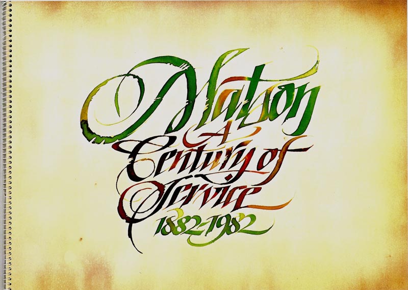
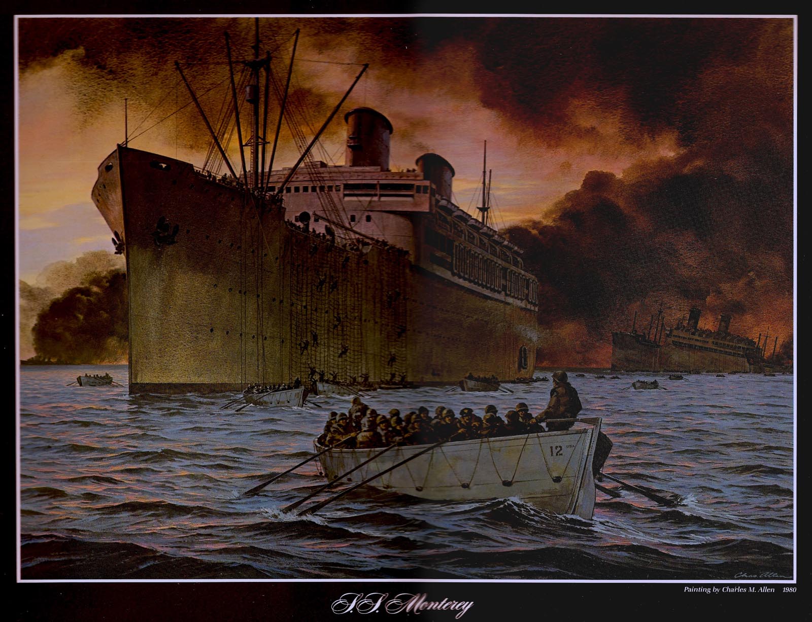
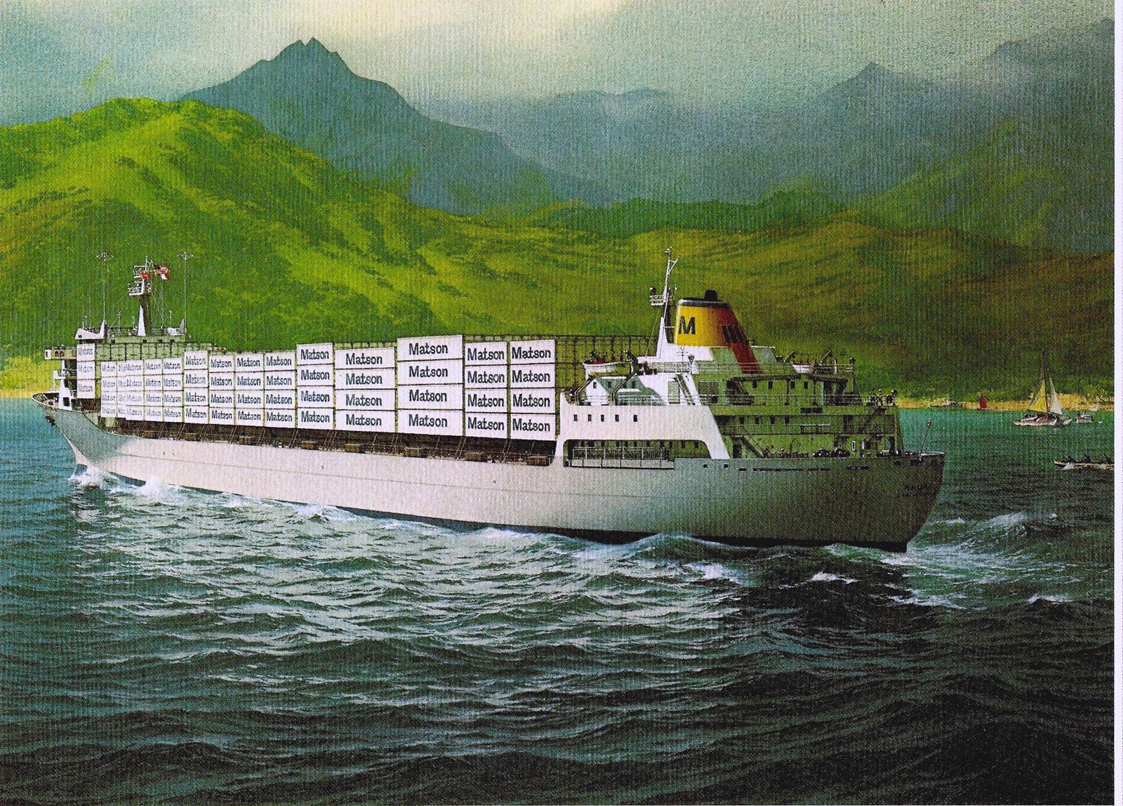
We're back to the Matson Centennial brochure and my third painting, originally planned for Carl Evers. Before getting to that, a comment on the SS Monterey illustration posted last week. One 'old salt' at a Matson hosted luncheon asked why I had omitted the gun tub on the bow of the ship. It seems when the troop ships had been modified and painted grey for military service, several gun installations were added....bow to stern. I told him the only reference provided was of the 'Lurline' and 'Monterey' in peacetime white....no gun tubs! At that time I had just received a B&W photo of the SS Enterprise, Matson's first non-sail freighter. Once again, an ancient photo....and the only reference Matson had of the ship. The same 'salty gentleman' had served on Matson ships since the early 20's. I asked him if he knew what colors were used on the 'Enterprise'....the hull looked pure black....and neither Matson nor agency people had an idea. He replied, 'we called it brindle-shit brown!' I don't think Windsor-Newton gouache included that color....but the hull was duly illustrated in various shades of umber, the super structure, Matson yellow with white trim.

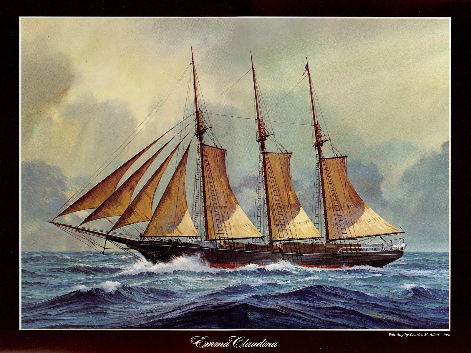
Going back, a better scan of the 'Emma Claudina' photo.


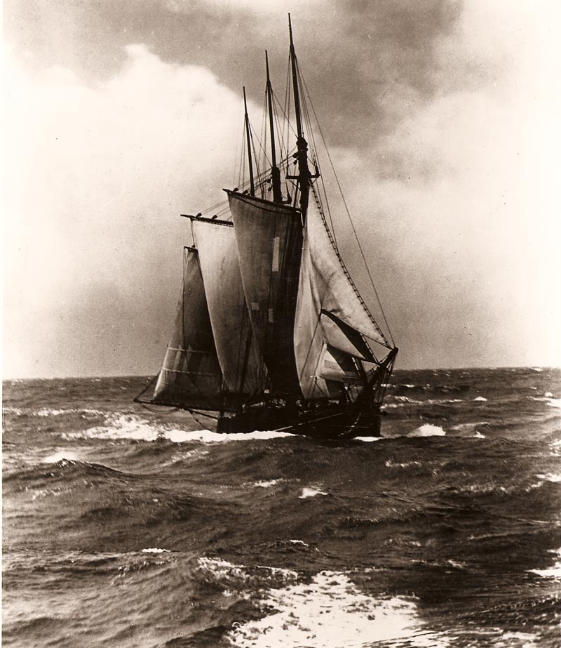
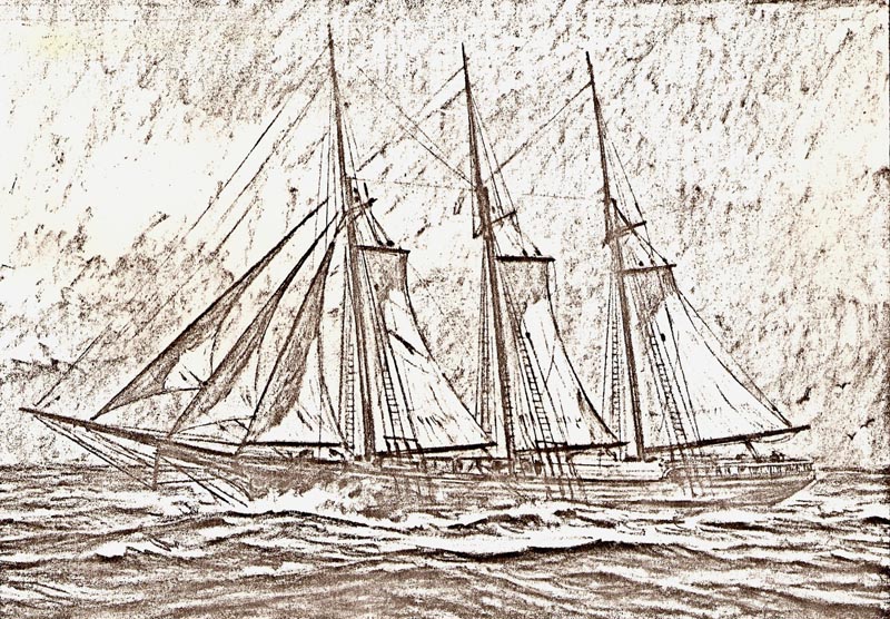
In this it had become a coastal lumber schooner. They were often heavily loaded....a mere foot or two above water line. Next, a poor scan of an early comp done before the Claudina painting.


Following, and finally, the 'SS Enterprise' in 1902 at Hilo Harbor, on the big island of Hawaii. The 13,700 foot Mauna Kea volcano in the background, at times of the year snow covered....in a tropical climate! The Enterprise was a small freighter, the first oil powered ship in the Pacific. It took general cargo and 22 well fed travelers....at $50 per trip!


Next, a commission several years later from the Matson Company direct. They wanted a large oil or acrylic painting on canvas to present as a gift to an old Japanese shipping company, NYK Lines, on its' centennial anniversary. The companies had cooperated for many years with shipments, ports and facilities, and deliveries. The subject was NYK's first container ship leaving San Francisco bay.


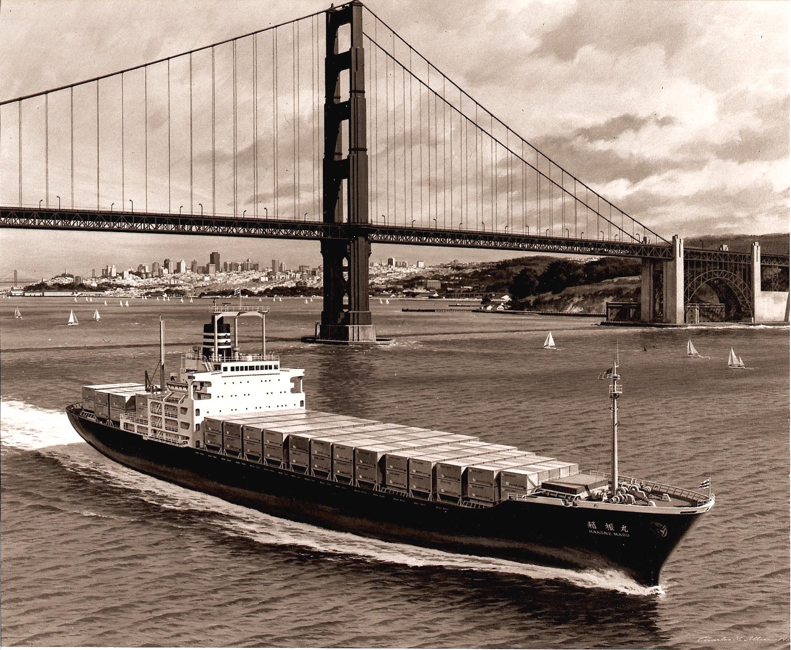
On the painting (this copy is my only record) I used both oils and acrylics. It was finished and framed in the mid 80's. The dark Golden Gate bridge was it's usual industrial red in the painting.

Last, and displaying my limited marine painting portfolio, a color comp for one of those 'less established' clients that have been mentioned on CAWS....a client that needed better 'vetting'. At the time, president of the S.F. Yacht Club, he owned and raced a high tech crewed sail boat and wanted a painting for his Marin Co. Savings and Loan office. Also, he wanted to see a sample of sail boats on the bay. I knew nothing about his yacht....and whipped out this comp.


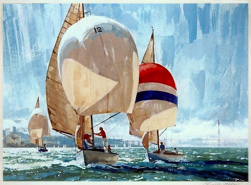
He put it down as 'small time', and ordered a painting of his boat on a windy, stormy day, the GG Bridge in the background. Also he finally produced a photo of his Class (?) racing boat. The painting was completed and accepted....but never paid for! Another story for another time!

* Charlie Allen's Flickr set.

Tuesday, September 22, 2009

'THERE'LL BE A CHANGE IN THE WEATHER....A CHANGE IN THE SEA.... FROM NOW ON THERE'LL BE A CHANGE IN ME....'

One of the great old pop songs from the early 30's, composed by Billy Higgins, if not mistaken. I seem to recall Fats Waller had one of his classic piano and vocal renditions of the tune. Yep. the CAWS doesn't need to remind....all together now....'change is the constant!'

In the late 70's both print media and the ad business had changed drastically. Gone were the billboards, many of the magazines, most of the big print ad budgets. TV was taking over. A lucrative illustration assignment in San Francisco was rare. Sometime in 1979 it came as a welcome surprise to receive a call from Allen-Dorward with a request for three large marine paintings....for an ambitious Matson Centennial brochure. Three known ship or marine artists had been commissioned by the agency. I was the fourth artist selected. Included was Carl G. Evers from the east coast....a well known and widely published marine artist. I had clipped Evers ad illustrations over the years with great admiration for his talents. The project had already begun....Evers had completed his first of two. The painting subject, a modern Matson container ship approaching Hawaii. Evers was 82 at the time....and the dozens of tiny Matson logos on the container ship boxes caused his hand to cramp up. He complained....and chose to do only the one painting. Hence....I was offered three paintings instead of two.

As usual, these stories get too long. I was not known as a 'marine' painter....but helping out in this case, the AD for the marine paintings was a former BBD&O art director. I had illustrated Matson tourist ads for him (earlier posted on CAWS)....his name now escapes me....and I must assume he chose based on trust. The painting size was to be a minimum of 19 x 25 inches....large for my style of work....and the paintings were to be hung in the Matson building offices in San Francisco. The medium could be oils, acrylic, or gouache. Evers was a master at gouache painting....and because I was more familiar with it, I chose to 'emulate' Mr. Evers. There was no way to match Carl Evers masterful handling of the sea....and it meant a lot of homework and study to attempt the various moods and conditions of the ocean. It also meant returning to a more academic style of painting. That was mentioned earlier on CAWS.

The scans will begin with three of the opening pages in the 12 x 18 inch well designed brochure.


The art director on the brochure design was a beautiful and talented young Chinese lady, Winnie Lum. The pages were on heavy stock, spiral bound....and the well written brochure covered 100 years of Matson history from sailing ships to modern container ships. Each painting was accompanied by a brief history of service and accomplishments.


The second introductory page shows a dark, indistinct photo of a three masted schooner, the 'Emma Claudina', William Matson's first sailing ship. This ancient B&W photo of the heavily loaded schooner was the only reference Matson possessed and provided for my first painting. It required a lot of research in libraries, books on sailing vessels, and time spent at the S.F. Maritime Museum to accurately portray a profile view of the 'Emma Claudina'.


Illustrating it in heavy seas in the mid-Pacific was still another challenge.


The painting of the SS Monterey, in wartime duty as a troop carrier in the Mediterranean, was the second painting requested. Both paintings were done in 1980. Monterey had been one of two Matson tourist liners to Hawaii....before the age of air travel in the Pacific. In WWII both ships served valiantly as troop carriers, mostly on the Atlantic side. In this scene, the convoy had been under attack by German bombers. The Monterey survived and rescued over 1600 Canadians from the former Grace Lines troop ship.


I wanted to illustrate the attack....but the agency stated, 'we don't want to start WWII all over again....just show the rescue!' The smoke screen depicted was put up by escort destroyers in an attempt to protect the convoy. Pencil comps were made and approved by the agency and Matson ad people before the paintings were begun.

Last, the illustration by Carl Evers of the Matson container ship 'Kauai'.


A typically professional and inspiring gouache by Mr. Evers. It was a loss that he didn't complete the second painting. The brochure story will continue in next week's CAWS.

* Charlie Allen's Flickr set.

Tuesday, September 15, 2009

MORE 'NOT SO GOLDEN' OLDIES....

It's really Leif's fault! Earlier in the week I had complained that these ancient ads were boring the pants (maybe it was the socks) off viewers. He hastened to assure that the Nielsen ratings were soaring....or maybe it was Google, and maybe slightly up....details, details! For better or worse, the CAWS will stuff most of the remaining old ads in this week's blog....and hopefully take a new tack next week. That's a sailing term, as I recall.

Not in any sequence on these, part of a Washington Apple store banner....the fruit against a 'carved' wood sign board.


Then a Safeway house-brand coffee halftone of a lady shopper, from 1951, and hopefully not a repeat.


A Kaiser Chemical green and black duotone illustration for a trade ad....an early 50's gouache rendition. Kaiser had a steel manufacturing division....in addition to Aluminum, auto manufacturing, refractory products, as well as other enterprises.


And while Kaiser Chemical is the subject, another gouache duotone illustration for the refractory part of the business....proof dated on this, 1952.


A tad 'menacing' would be apt....but anything to get attention!

Next, two halftone ads for Pan American....for Hawaiian newspapers in '56. A couple of others in this series have been posted...


...and done in the 'square' style mentioned a week or two back.


Following, four B&W line ads for Chevron....again from the 1950's.


The first two are both semi cartoon illustrations, and both part of larger newspaper ads.


The second two are also partial ads....in the more literal line style I normally used.


It is obvious today, the 1950's was a time of great variety, and of plentiful ad assignments....a condition and state of business that we didn't really appreciate enough at the time.


No one had an idea that major changes in print media were coming in the next 10 to 15 years.

A Pac Bell employment poster follows....about 15 x 20 inches in size....and the scan is from the poster. This came along in the early 60's and demonstrates a difference in approach. These heads were what I'd call 'generic'....nice looking young people drawn without photo reference. In the 50's, model shots would have been taken. However, not needed or wanted by me or by the client in the 60's. I'm pretty sure this was the ad that caused the dispute mentioned earlier on CAWS....about the AD, or client, who wanted an ever darker skin color on the girl on the left. Different times, indeed.


Finally, a Western Pacific train ad from the early 50's....a very poor scan from an old news clip.


Then a simplified Burgie head logo for shipping boxes. Done in three flat colors, as I recall, due to a silk screen or basic printing process for boxes.


Last, for Schilling seasoning products, a B&W line illustration of a Mexican casserole. Line art to illustrate food....and trying to keep the subject appetizing....was a difficult assignment.


Dan Romano in San Francisco was probably the best illustrator in that field.

* Charlie Allen's Flickr set.

Tuesday, September 8, 2009

'.....OLD, NEW, BORROWED, AND BLUE'

Something old has never been a problem on CAWS....it's all old! The question becomes....Pleistocene, or Jurassic? As I reach the bottom of the venerable proof drawer, there is old, and then older. The examples bring a fresh reminder of how poor were my attempts for the first two years or so, in San Francisco. On some, even longer. Many of the old proofs are missing or will never see the light of day. Progress was there....but slowly. As said before, it was a steep 'on the job' learning curve. With classic youthful optimism when first interviewed, thought I was ready for 'prime time'. The moral is to all young artists....find a market, hang in, and work hard....there is hope!

We'll start with blue, at least partially so. A full page late 50's Burgie ad in the SE Post....and one that I've avoided. Not my favorite illustration....both subject and handling. A photo op at the Sausalito marina was arranged by BBD&O....photo subject, someone's boat, as shown. The AD also wanted included the background homes, hillsides, etc. An illustration that just never came off....as much my fault as the concept.


A Washington State Apple POS poster follows. Large, 20 x 30 inches, and here, a patio photo of it....so not a good scan. At full size and in the store, it was not as hard edged appearing as on the scan.


Next, one more Dodge two color newspaper ad....a 1968 Dodge Polara. I still think the series of four illustrations were bright, effective ads.


A few B&W illustrations follow. The first, a news ad for the Villages, a large south bay home and golf course development encouraging seniors and retirees.


Then a newspaper ad for Hill's Brothers Coffee, from the 50's. A good friend posed for the postman. He was actually with the FBI....and was warned to NOT pose for any more ads!


A simple line ad for an east bay Marriot Hotel is next in line...


...and then a very early '49 or '50 ad for Levis for boys. The 'stove pipe' look on the pants was, I'm sure, established by Bruce Bomberger on a fine series of Levis billboards....and the client liked the look. This was an early attempt for me to break into the 'better' ads.


Last of the B&W's an early Hexol ad....several have been posted before. Yes, back in the days when boys and girls were bathed together in the same tub!


Finally, three more of the early 70's antique autos...


...the first two from prints...


... and the third from a reduced copy of a fairly large original. It portrays a 1929 Kissel convertible, complete with 'his and hers' golf bags attached....from the 'roaring twenties'.


Not sure if this was really finished....but close enough.

* Charlie Allen's Flickr set.