Tuesday, January 27, 2009

COMP THIS....?

In the interests of change and diversity after several weeks of Chevy ads, the CAWS will return to comps....and, for better or worse, there will be more later on. Comps, as said before, can be just about any kind of presentation before finished art was ordered. They could be as simple as a rough pencil sketch, or a tight rendition in paint, marker, or charcoal pencil. Comps, to me, are interesting....more vitality, energy....often showing more of the creative side of illustration. Finished art usually showed a more technical demonstration of the illustrator's ability to get the job done. Wish I had saved some art director comps from which I worked. Mostly rough, due to time constraints, and to having to churn out so many before the client gave an 'OK'. That actually helped us.....almost anything the illustrator did was an improvement! Once an AD comp came to the illustrator, or a requested comp was provided to the agency (about half the time), there was financial commitment involved....even if the comp was not approved for final art. On occasion, my comps were used as final art. One major national corporation (who will remain nameless) ran my comps on their barbeque briquet packaging for years....having paid only the much lower comp price. Time and cost made it not worth litigation.

Let's get to the comps....and diversity....something I enjoyed over the years. First, a Del Monte children's coloring page, an old fashioned country scene....a point of sale offer.


Not too successful as I recall, but anything to get shopping mothers involved. The comps first...


...then a finished version....from a weak copy, my only record.


Next, a loose comp of a shopper for a Safeway promotion.


Then, a line marker drawing for a story board....minus the usual marker color....can't remember the product. Pancakes, juice....or? Done in the late 60's I believe.


For Japan Airlines....several grey marker comps, again in the late 60's or early 70's. I can't recall the intended use....but finished art was never done.


The large one, shown in sections, was at least full page newspaper in size.


They provided reference on the background decor and stewardess costumes....but the figures were just sketched....very generic.


Almost like mannikins....same age, handsome, no charachter....but after, all it was a comp!


Following....not a comp....but a typical Del Monte B&W plus halftone trade magazine illustration of a vacationing shopping family.


Finally, a charcoal pencil comp for Dole fresh mushrooms....and again, can't remember where this ad appeared.


* Charlie Allen's Flickr set.

Tuesday, January 20, 2009

As Basie said....'One More Time!'

'WHETHER TRAVELING LIGHT OR WITH A LOAD THAT'S HEAVY,
PERFORMANCE IS SWEETER, NOTHING CAN BEAT 'HER
LIFE IS COMPLETER IN A CHEVY....
SO MAKE A DATE TODAY TO SEE THE U.S.A.
AND SEE IT IN YOUR CHEVROLET!'

OK, OK.....that should do it for the Chevy ad jingle....as well as for most of the Chevy ads I illustrated. We'll begin with the now familiar yellow Corvair ad done sometime in the 60's. As with many jobs, a story goes with it....hopefully not too boring.


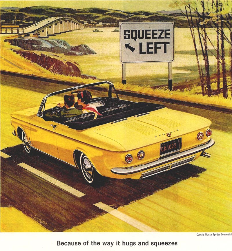
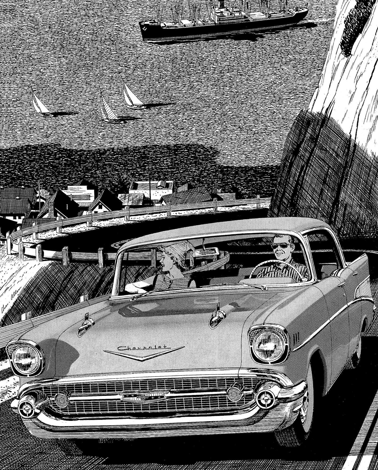
Chet Patterson and Jim Hastings, sometime in the 60's, had a falling out. I never knew why....and this ad came through Butte, Herrero, and Hyde, a well known creative-design team in S.F. Several illustrators were invited to submit color comps for two magazine ads. Mine and Gordon Brusstar's were selected by Hastings. My comp had the same bridge and bay scene, 'color coordinated' around a light blue Chevy Corvair. The Chevrolet people liked it, but ordered a yellow Corvair to replace the blue. That, I reasoned, encroached into my ' artistic domain'. No way could I illustrate a bay scene coordinated in yellow tones! On the finished art, I changed the background to a rural New England scene....a small maple sugar outfit, trees, barns, a few patches of late snow, etc. Jim Hastings liked it, but it was turned down flat by Chevy. The illustration was sent back....it had to be the bay scene....or else! To save all the hard labor on the Corvair, I covered and masked it....sponged off the maple sugar location, gessoed the background, and re painted the bridge and bay. Yep....in color coordinated yellows, greens, etc. So much for artistic liberty!

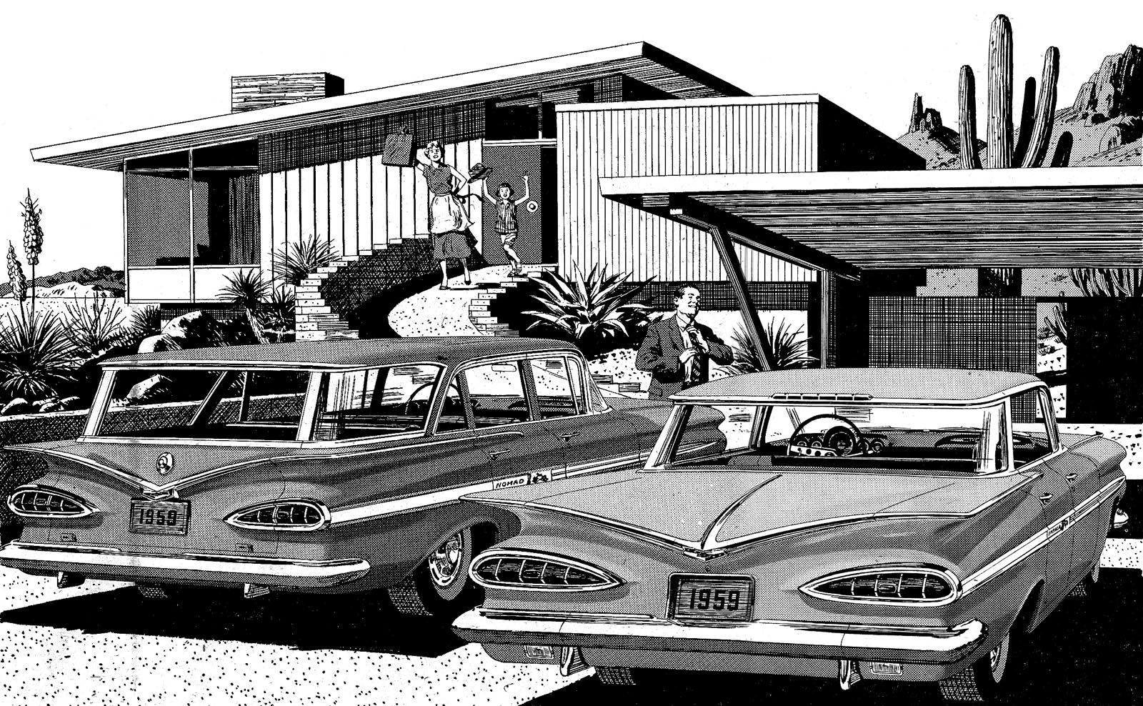
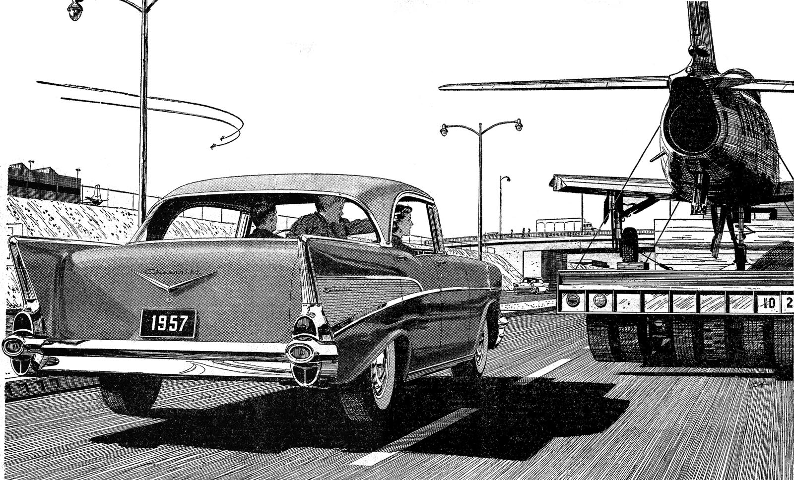
The next scan, a double page ad in the S.E. Post, a profile view of a 1955 pink and black Chevy.


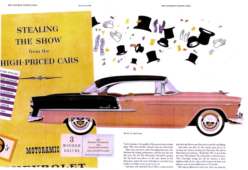
General Motors was very proud of this car....the first 'wrap around' windshield in the business, a great new V-8 engine, a new look.....and of course, a big seller. This ad was the first color assignment I had received from Campbell Ewald....and a Jim Hastings layout. In the mid 50's two color autos were the new 'in thing'. We owned a '56 Chevy station wagon in grey and white.

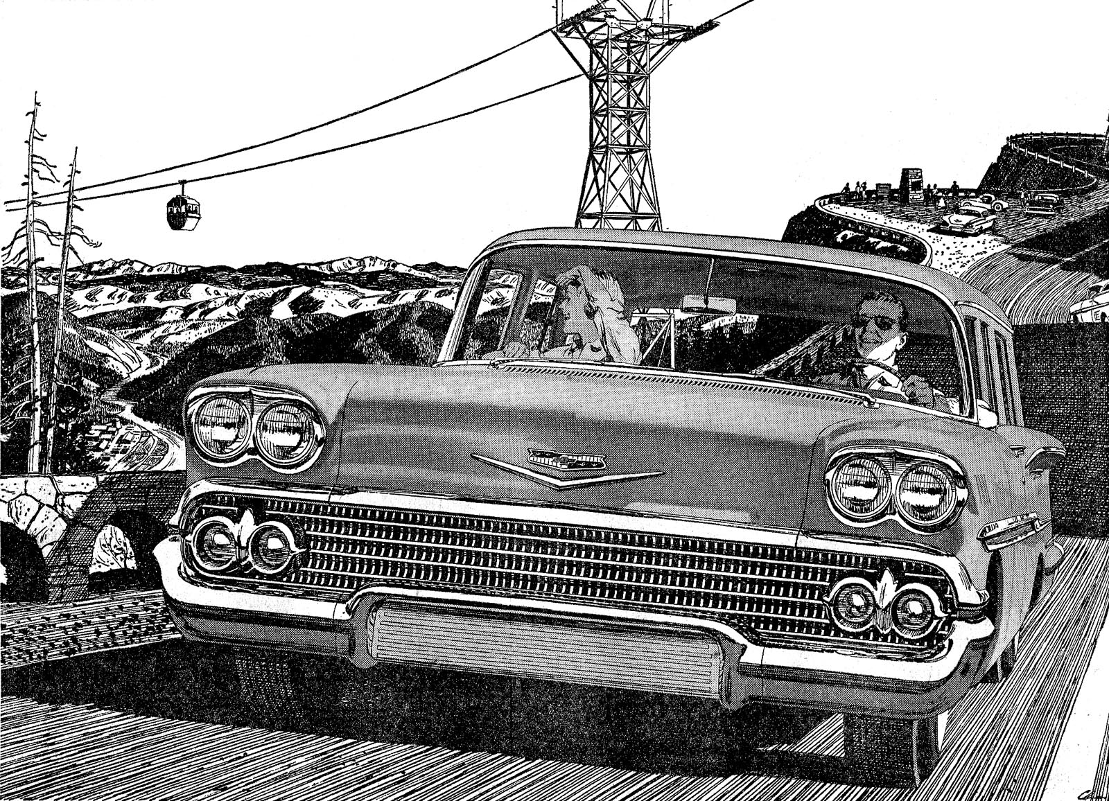
Following....three color illustrations scanned from 8x10" B&W photos taken at P&H before the jobs were shipped. Actually better fidelity than something in color. First, another hill scene for magazines, previously seen here on TI in color. I liked the background vignette of the boiling over hot rod, young owner, and disgusted date.


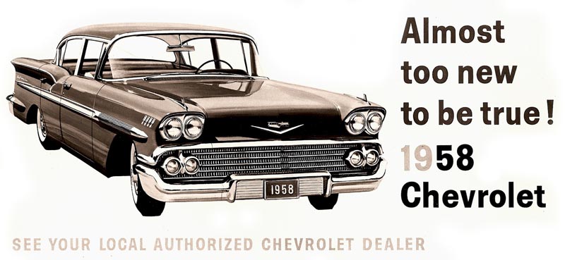
The next two were Chevrolet national billboards....a 1958 Chevy...


...and a 1957 Chevy convertible showing the couple with the door opened. An unusual concept for Chevy, but considered successful. A bright, colorful ad with a teal blue car and a yellow dress on the young lady.


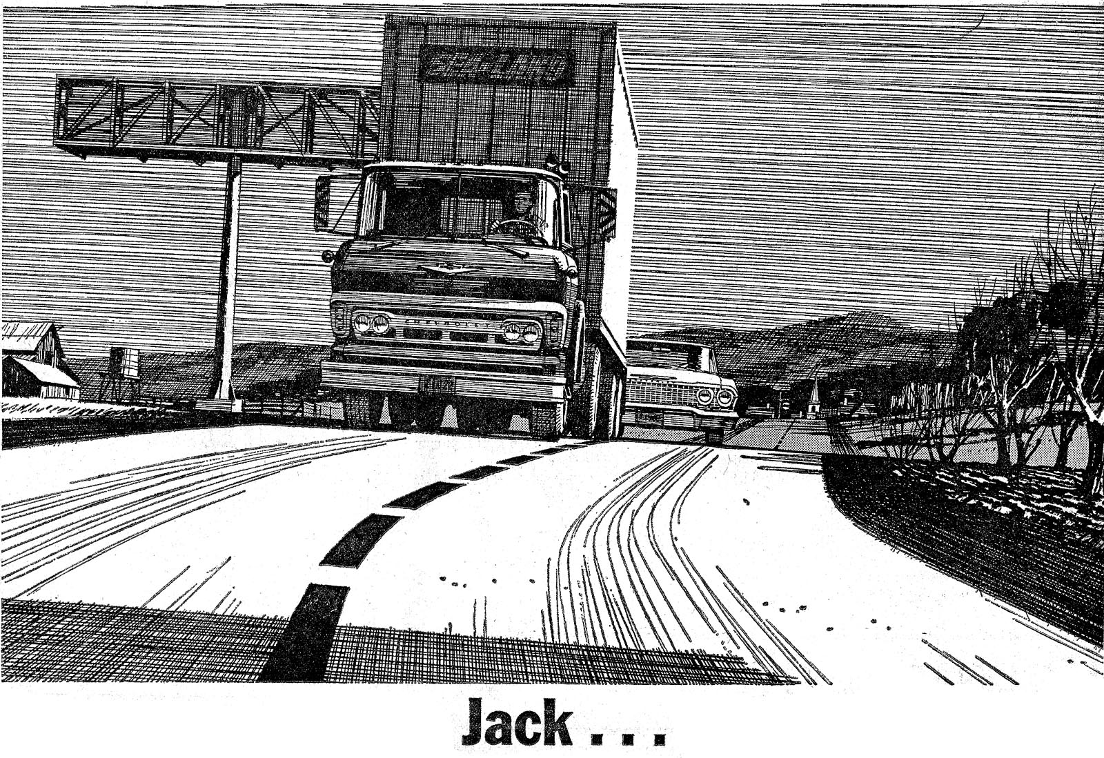
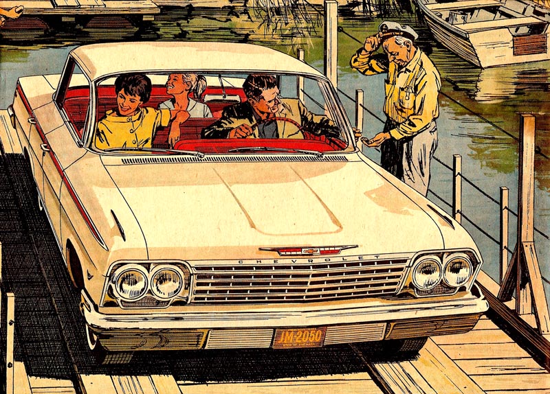
Next, a '62 Chevy full page newspaper B&W line, plus color, ad. A rural 'lazy river' car ferry scene....no doubt somewhere in the south. I had to pretty much 'design' the ferry...and it was probably not all that feasible for a real life operation. Once again....advertising! Done in the usual method....a B&W line film pos over a color rendering.


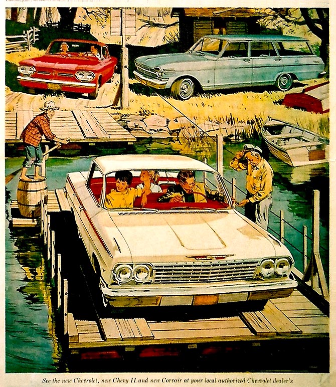
The close up of the Chevy is a better example of the way it looked.


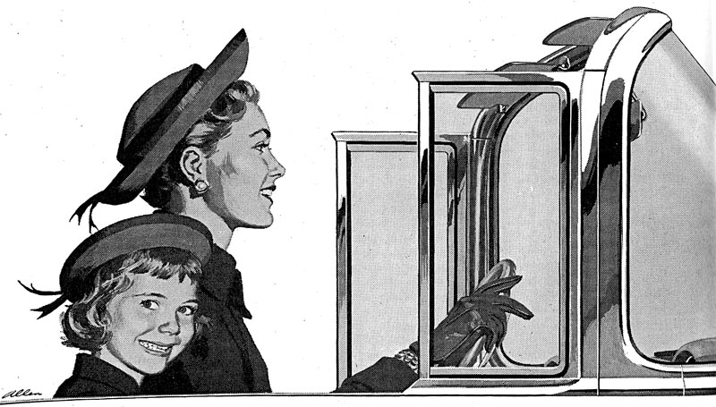
A different kind of ad follows for 'Body by Fisher', a separate division of GM, as I recall. 1955 saw the first 'wrap around windshield' in the auto industry, and Chevrolet was very proud of it. This, a B&W halftone, just the windshield, the roll out 'wind wings', and chrome moulding ....my wife and daughter, the models. Not sure where the copy and headline were....probably under the art.


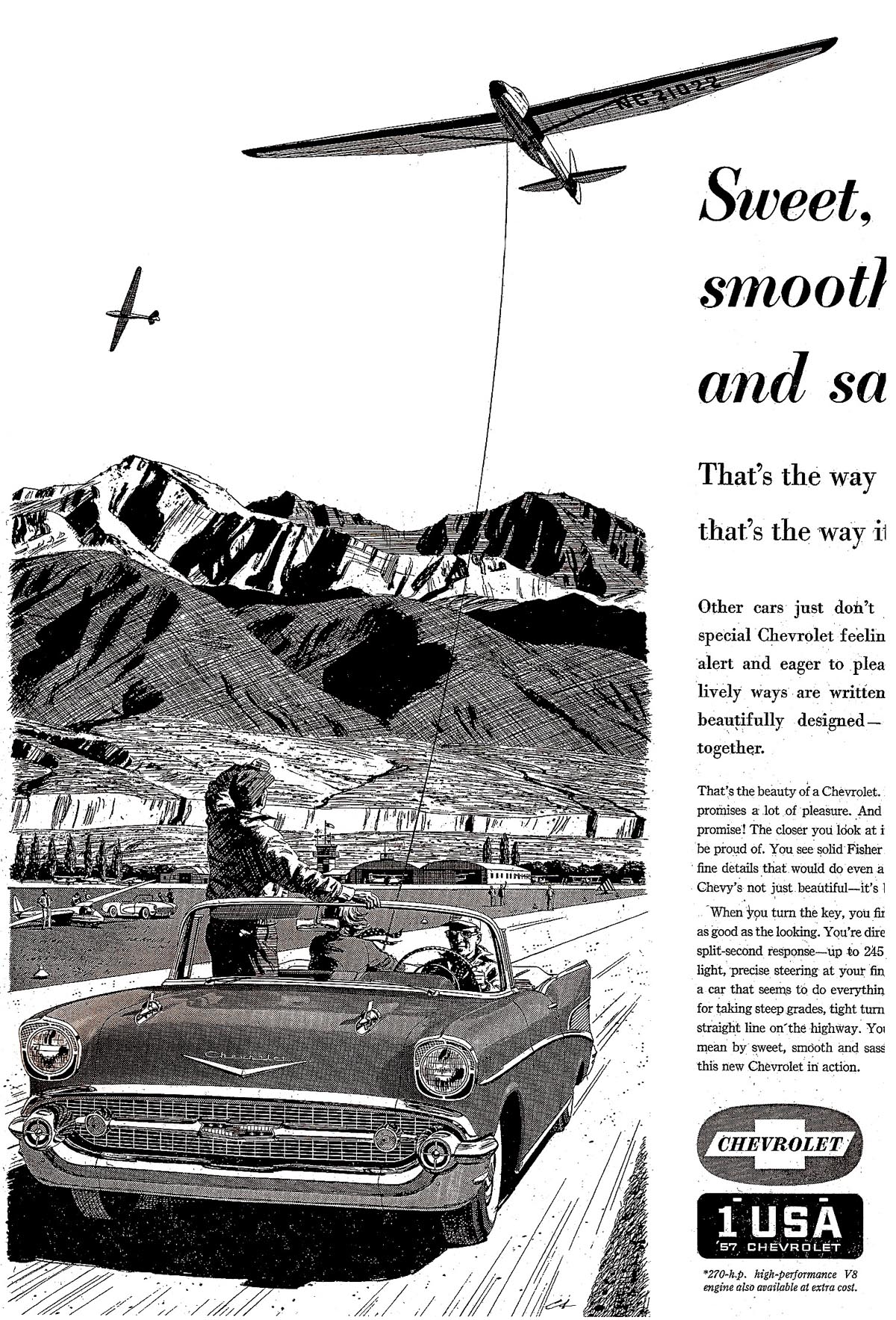
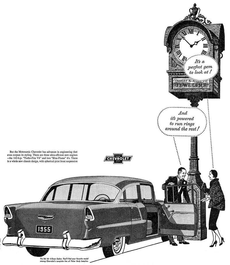
Last, my first or second Chevy B&W ad. A posh, morning coated, striped pants with spats, jeweler....helping an equally posh lady into her '55 Chevy. Must have been an expensive purchase! The tall street clock, a close copy of a well known clock on Market Street in San Francisco.


* Charlie Allen's Flickr set.

Tuesday, January 13, 2009

Second stanza....all together now!

'DRIVE YOUR CHEVROLET THROUGH THE U.S.A.
AMERICA IS THE GREATEST LAND OF ALL....'

[Credits to composers Leo Corday and Leon Carr, the Peter Lynd Hayes/Mary Healy Show, the Dinah Shore Show, Chevrolet, ASCAP, et al.]

Yep....the Chevy jingle again...with good reason. It was very much a part of the 1950's radio and TV advertising culture, along with the newspaper and magazine 'Chevy blitz' to which so many illustrators contributed. This week more Chevy newspaper B&W's....then we'll finish the Chevy illustrations next week with a mix of billboard and magazine ads.


Once again, Leif is 'elected' to patch together partial scans from full page clips and newsprint proofs. It seems to be the only way to come up with decent scans on these B&W line ads. (Click on each image to see a MUCH larger version.)

First (above)....a 'could be' Arizona location and family scene....conjured up from imagination, and from our very different northern California environment....grassy hills, bays, oaks, redwoods, eucalyptus, etc. I was aware in those days that the tight rendering on the cars tended to add the same style to the rest of the illustration. Pretty hard to 'loosen up' on Chevrolet ads! I finally did....on the yellow Corvair magazine illustration seen earlier, and maybe again later on.

Following, another steep hill concept, so favored by Jim Hastings and staff at Campbell Ewald. This is a fictitious bay scene....whose bay? Not sure....somewhere in the 'wild west'! Again....it's advertising!


Then a mountain road location with a cable and gondola overhead. Sharp eyes will notice how I 'cleverly' sneaked my TR-3 sports car into a Chevy ad....in the scenic pull out in the background.


The 'Jack Robinson' illustration should be next....and I seem to recall the agency and Chevy liked this ad.


Next, a must inclusion of a glider scene. A tough assignment, as I remember, getting car, glider, background and all, in the picture. I had in mind a quiet glider-friendly airport, maybe in the Tehachapi Pass area of the Sierras. Not so sure I would want to be in the glider....an early release at a low altitude could ruin your whole day!


Finally, one more oldtimer that hadn't worked earlier. Comment....not much, except I can't remember where I took the shot looking up the tailpipe of a military jet....but probably at Alameda Naval Air Station.


Here's the bridge....sing out now!

'ON A HIGHWAY OR A ROAD ALONG A LEVEE
PERFORMANCE IS SWEETER, NOTHING CAN BEAT HER
LIFE IS COMPLETER IN A CHEVY....
SO MAKE A DATE TODAY TO SEE THE U.S.A.
AND SEE IT IN YOUR CHEVROLET!'

* Charlie Allen's Flickr set.

Wednesday, January 7, 2009

'SEE THE...USA...IN YOUR CHEVROLET'

That second line may have been, 'America is inviting you to call...' It was the opening and closing theme, sung enthusiastically by Dinah Shore back in the 50's and early 60's on her weekly variety show sponsored by Chevrolet. Pleasant entertainment, typical of the day....songs and comedy by stars of those times....plus lots of commercials for Chevy and others. That was when General Motors was the blue-chip 'King of the Road', and the Chevrolet division outsold every other brand of car on the road. How times have changed in the intervening fifty or more years!


Chevrolet, through our relationship with Campbell Ewald in Detroit, was one, if not 'the', most important client that P&H and I had in the 50's and early 60's. Important, because all of their ads were national in distribution....and because the pay was better than on local or regional accounts. A long and complicated history, but to cut to the chase, Jim Hastings, a talented San Francisco artist, ad designer, art director, et al, became the head art director for Campbell Ewald in Detroit, and head of the Chevrolet account. He liked and favored west coast illustrators....Fred Ludekins, Stan Galli, Bruce Bomberger, Gordon Brusstar, Dan Romano....and....Charlie Allen. I was included a bit early....in the early 50's....really before I had enough experience. It was sink or swim....and I did some of both....on very complicated assignments. Even in the 50's there was overnight air delivery....so working long distance was practical.

We'll begin with scans of line art. Most of the dozens of ads I did for Chevy were large newspaper B&W ads...and most were line film positives over a halftone rendering on the car. I've found that line art and textures don't scan well....especially when a full page ad has been reduced to a smaller copy. Therefore, click on each image shown in this post to see a much larger version.

Hastings, and other AD's at C.E., promoted large ads with ambitious, dramatic compositions that were often difficult to render in pen, brush, and ink line art.


Above, a classic Jim Hastings concept....strong values, an implausible location with a wild-west stagecoach chase, a 1958 convertible plus movie directors, speeding along in a dry wash. I doubt if either of us had a clue how Hollywood would film such....certainly not with film crews perched on top of steep rocks, a director yelling with a megaphone from the car! Hey...it's advertising! This scan was from a glossy photostat, minus the halftone on the car, so the same as the film pos. In hindsight, wish I had asked for glossy proofs of these ads....but life was moving fast in those days...it didn't seem that important.


Next, again, strong values on a helicopter 'commuter dad' scene. Pretty sure it was a '57 Chevrolet. The cars had to be drawn as accurately and as 'sexy' as possible to please the Chevy people. In those days civilian helicopters were new. This was a Hiller (as I recall) that I photographed at Crissy Field, a small former military base on the S.F. Marina.

Below... a typical pencil comp that I did of a golf club scene....with multiple cars. I liked it, and Jim Hastings liked it, but Chevrolet wanted more cars showing.


The next scan was the result....a boring composition....but lots of Chevy's in the parking lot!


Finally, most of a full page B&W of a 1959 Chevy and family at a train crossing. Detroit was truly into the 'big, gaudy, fin stage' in car design by this time!


Next week....more B&W's and other types of Chevy ads.

* Charlie Allen's Flickr set.